MAVKA
Branding & Identity
Branding & Identity
Project duration:
2024-2025
My role:
Logo designer, Brand designer, Packaging designer, POS materials designer.
Responsibilities:
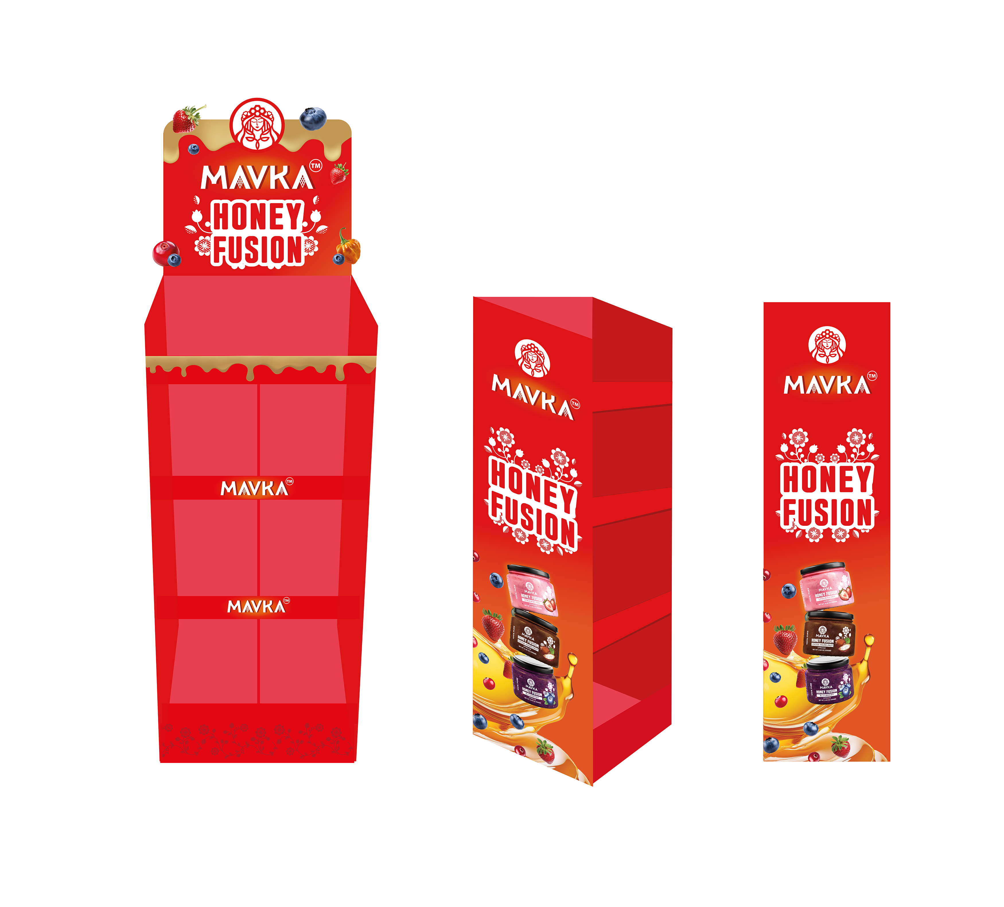
Logo development, Packaging design, POS materials
Tools:
Adobe Photoshop, Adobe Illustrator, Adobe Dimension, Adobe Firefly.
MAVKA is a Ukrainian honey that impresses with its natural purity and unique taste. Derived from the finest Ukrainian apiaries, this honey represents a true masterpiece of nature, carefully harvested and processed to preserve all the beneficial properties of natural honey.
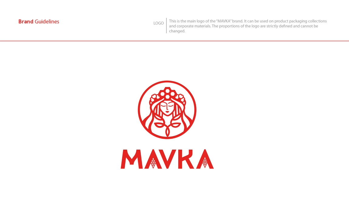
The MAVKA logo embodies a visual representation of Ukrainian mythology, personifying beauty and nature. In the depiction, a maiden inspired by Ukrainian folklore embodies MAVKA - the spring goddess of forests. Her hair is adorned with a variety of flowers and leaves, symbolizing the richness of nature.
The crown made of honeycomb and the bee directly signify the connection to the core product, honey. This logo encapsulates the core values of the brand, including natural authenticity, health, and product quality.
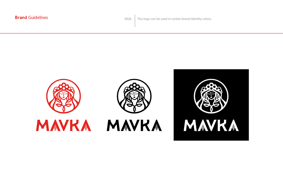
In crafting our brand name, i employed the use of the grotesque font, complemented by the inclusion of an ancient Ukrainian symbol representing the earth. Together, the brand name encapsulates a connection with nature, emphasizing the naturalness and uniqueness of our product.
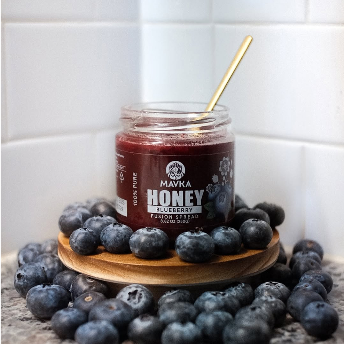
The label design for a series of honey with various ingredients was developed by me. I incorporated a minimalist Ukrainian floral pattern. For each flavor, I created illustrations in an engraved style, emphasizing the underscoring the long history of honey harvesting in Ukraine. These illustrations were hand-drawn by me on a tablet. I also chose a transparent label, this allows to show the real color of the product to customers.
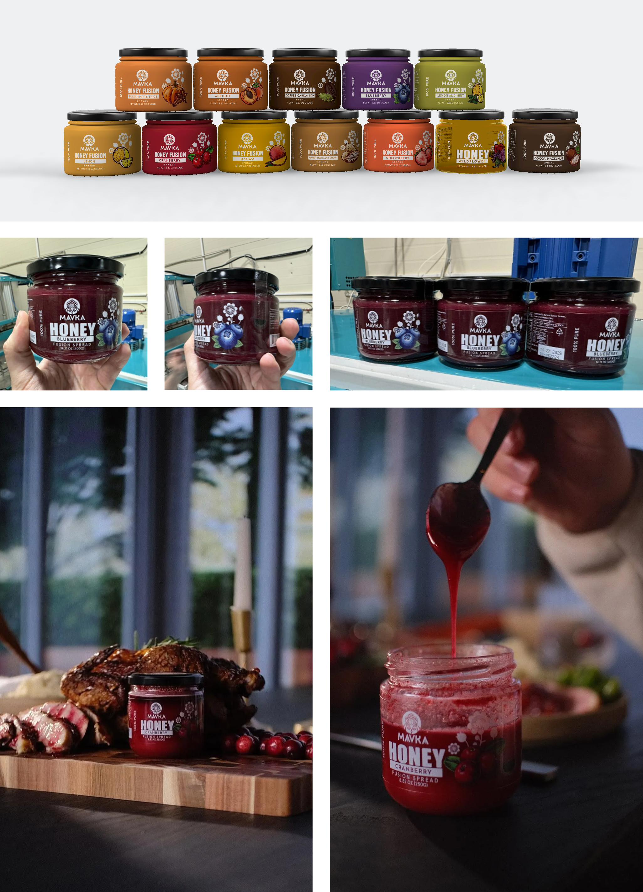
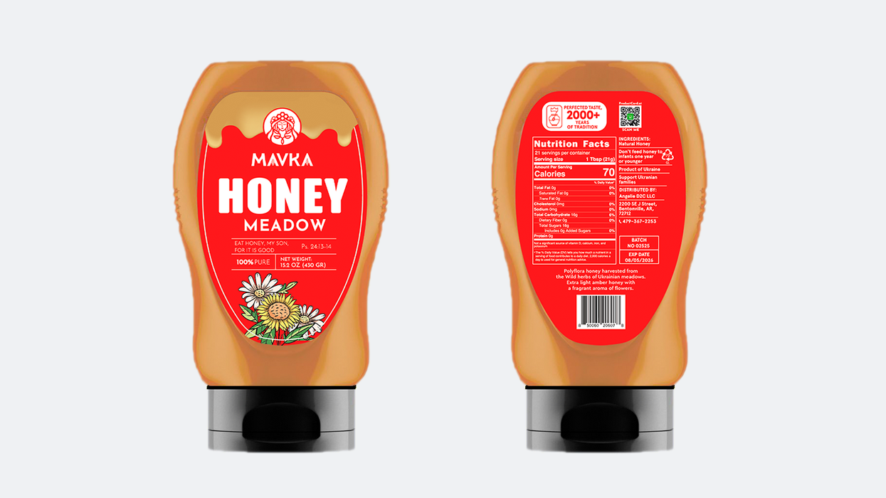
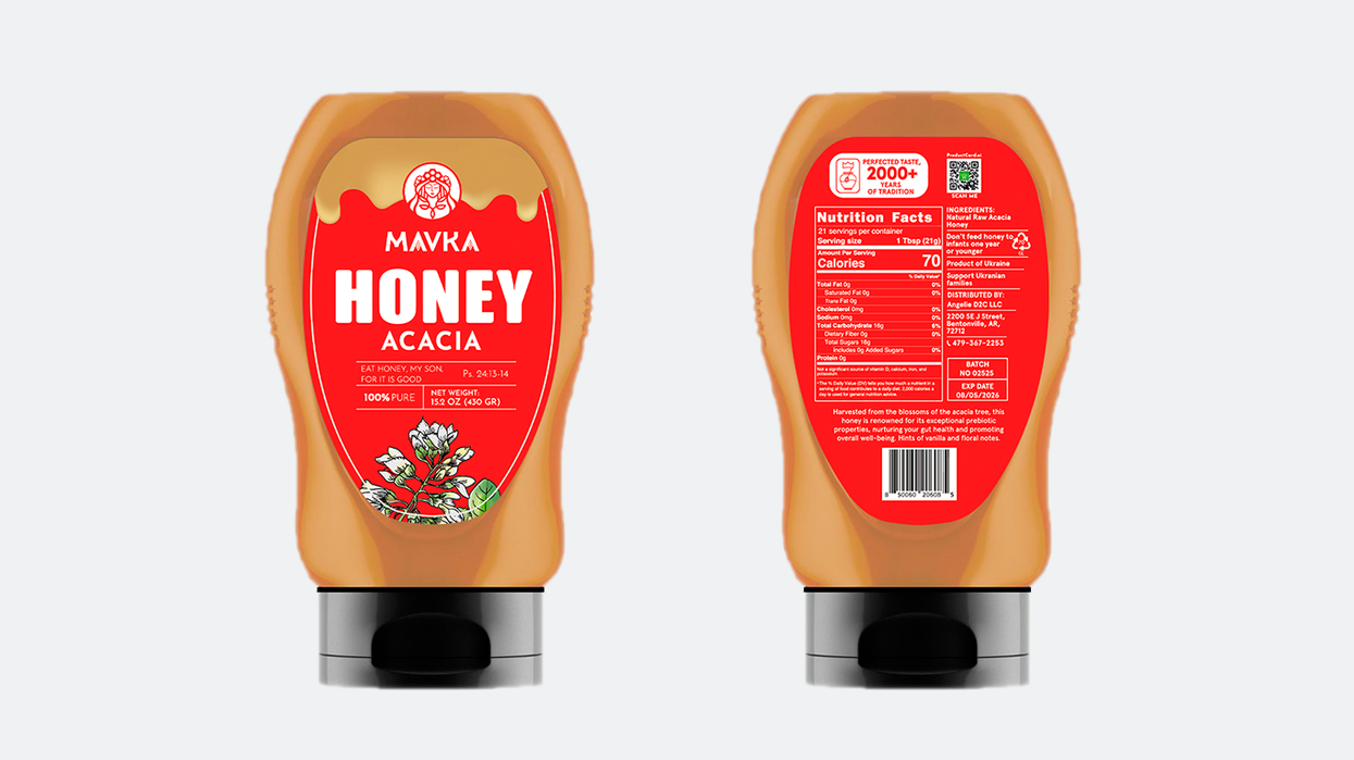
For liquid types of honey there was an approved PET bottle, convenient to use. After analyzing competitors and their influence on consumers, it was decided to choose a bright red color for the bottle. This allows the product to stand out on the shelf among its competitors.
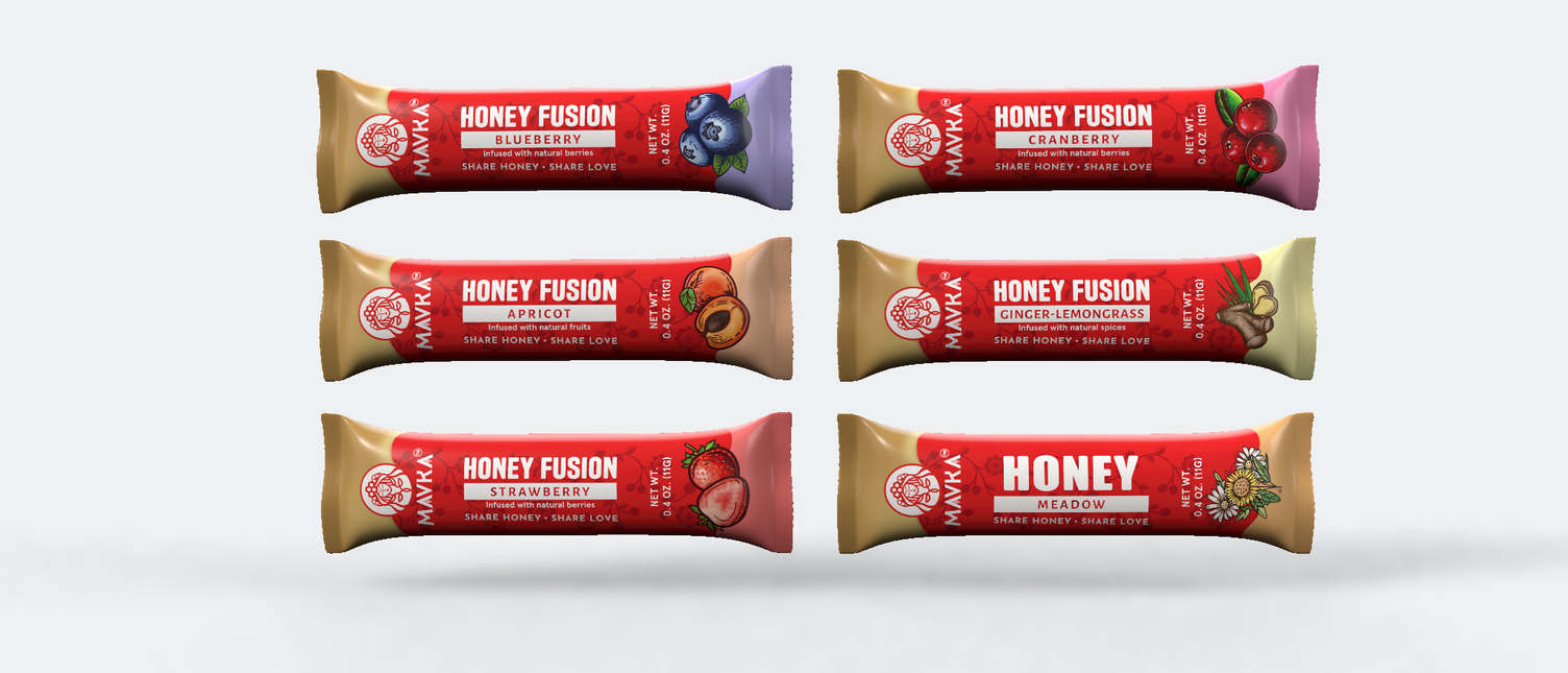
Our honey sachets are designed for convenience and portion control, offering individual packaging that ensures freshness and ease of use. Crafted in line with the overall brand design, the sachets maintain a consistent and appealing aesthetic.