Druid

CRM system
A desktop application

Project duration:
2022

Operating system:
Windows 10 and above, macOS 10.15 and above.

My role:
UI/UX Designer, Design System Specialist.

Responsibilities:
Wireframing, prototyping, visual design, design system creation, user testing, collaboration, documentation, accessibility compliance.

Tools:
Figma, Illustrator.

Self-service kiosk

Project Overview

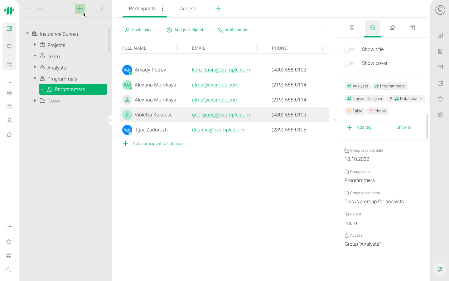
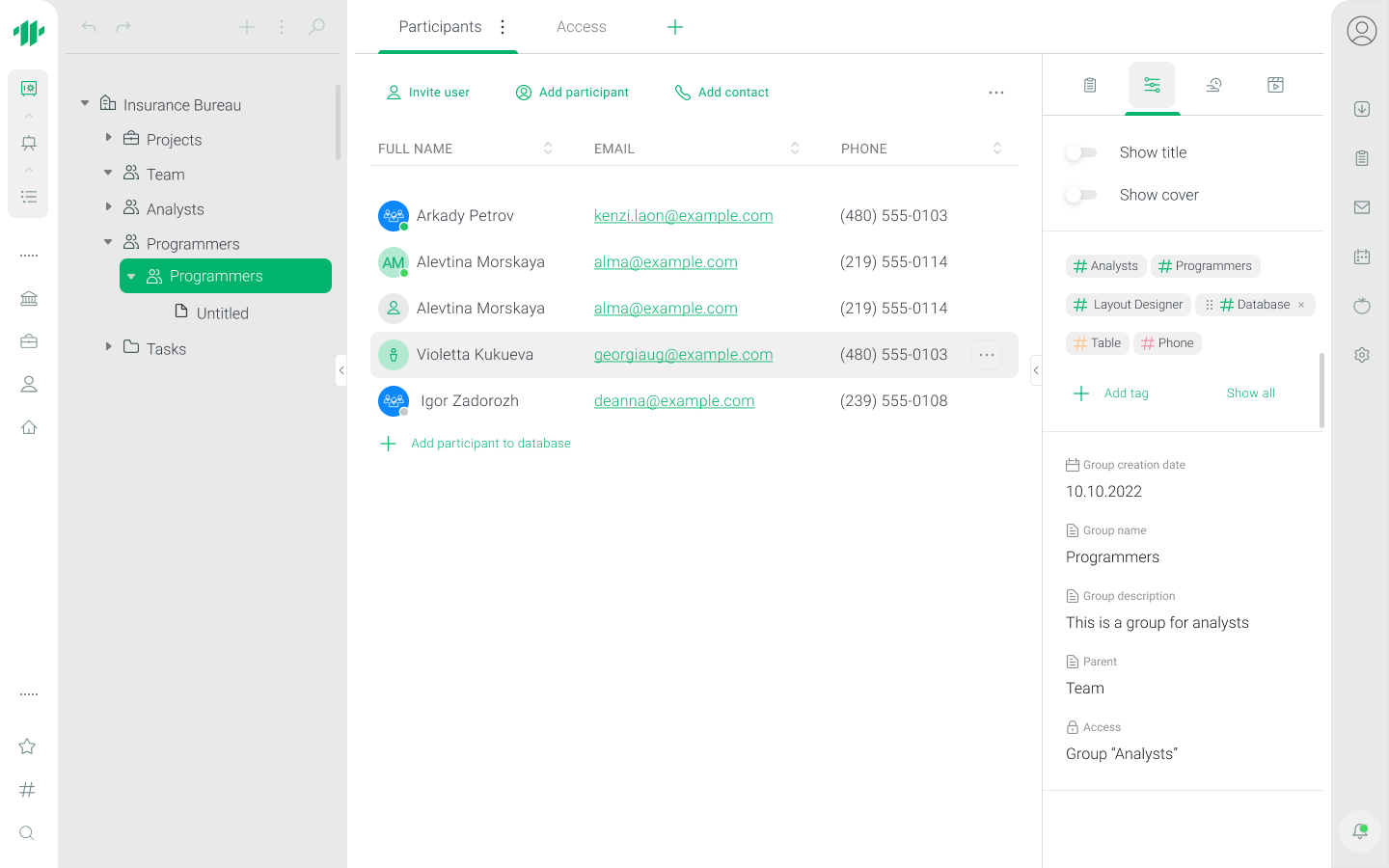
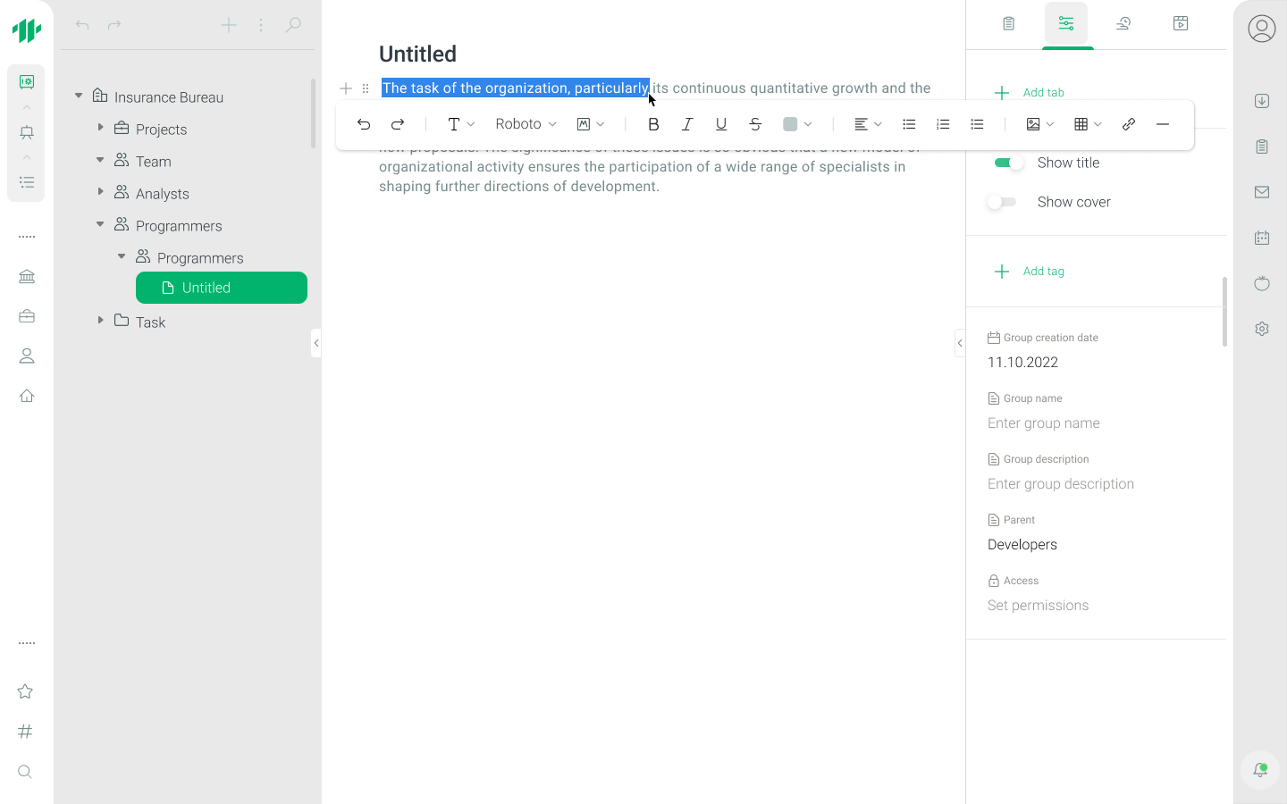
DRUID is a CRM system designed for a wide range of organizations — from educational institutions to warehouse enterprises — combining telephony, email, project and team management. The platform supports email campaigns, template-based website creation, data storage, and data management.

The system is aimed at employees who manage clients, projects, and internal processes daily. The goal was to make the CRM tree a convenient business tool: to manage objects, data, communication, and projects all in one place.

Problem

Analysis of current processes and existing solutions revealed key issues:

  • The app needed to support different levels of access — students should see only their own results, while psychologists/social workers require full reports.
  • There was a need for retesting options, saving intermediate results, and anonymous login.
  • Inconsistent UI patterns: different components looked and behaved differently, complicating developers’ work.

Without addressing these issues, the system remained cumbersome and slowed users down, increasing the risk of data management errors.

Goals

Analysis of current processes and existing solutions revealed key issues:

  • Design an intuitive UX for the CRM object tree that makes creating, editing, and grouping elements easy.
  • Develop UX/UI for composite fields and key components of the object tree.
  • Build a design system from scratch, using an atomic approach and auto-layouts.
  • Ensure WCAG-compliant accessibility for users with visual impairments.
  • Increase employee efficiency by 30–40% through standardized interfaces and optimized navigation.

Approach

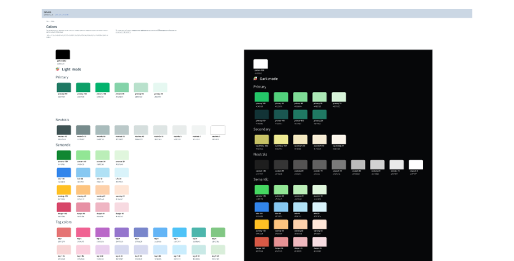
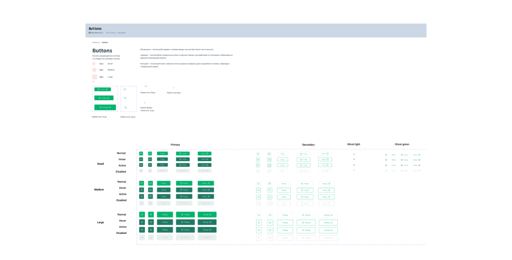
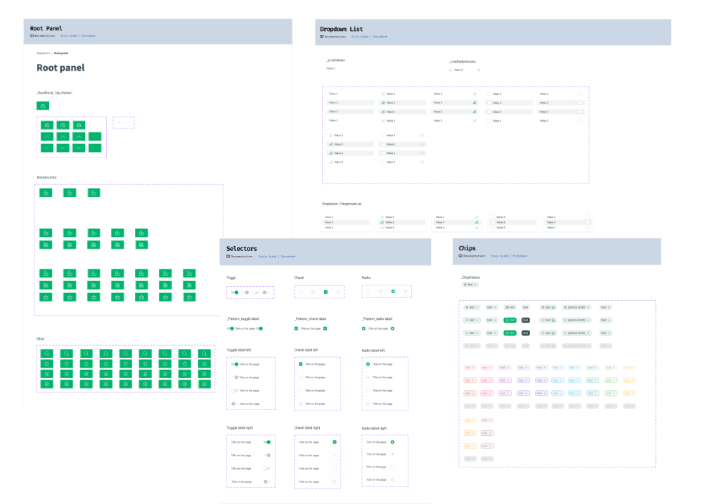
To create DRUID’s design system, I applied insights from Figma’s Schema Design System Conference, which taught me best practices from leading system creators. Key lessons I incorporated include:

  • Design Tokens as a single source of truth for naming and storing design decisions.
  • Using Tokens to maintain design consistency across the system.
  • Structuring the system for performance and scalability, prioritizing consumability for designers and developers.

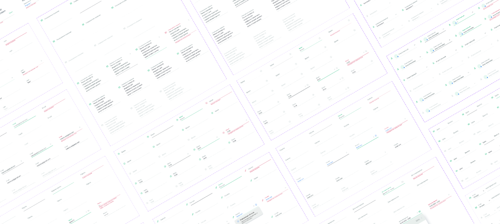
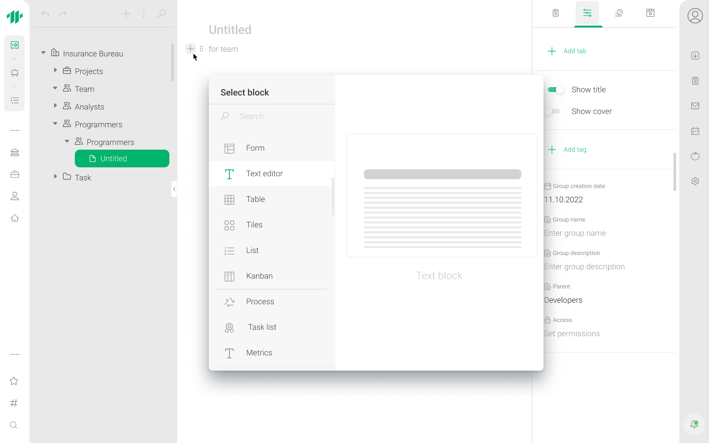
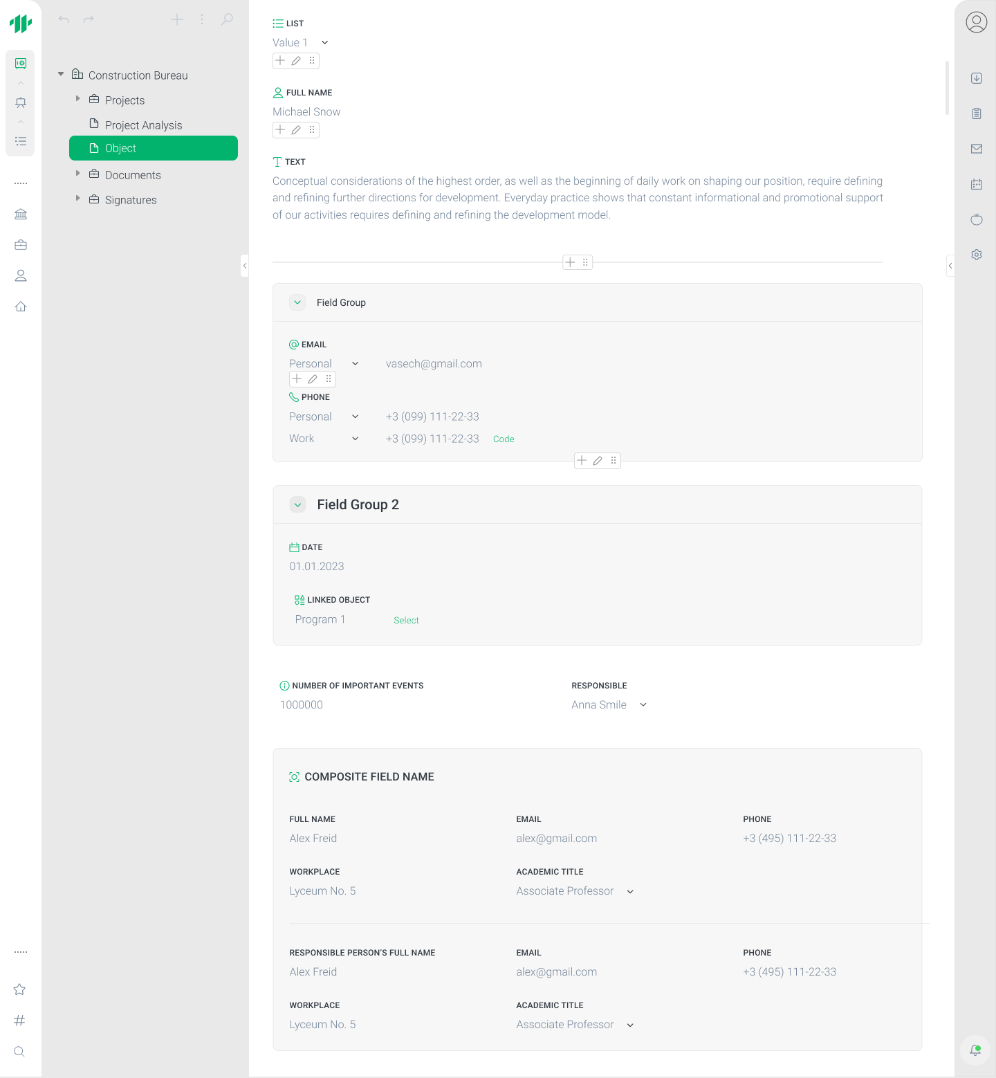
To manage complexity, I divided the design system into three atomic libraries:

  1. Color & Typography Library – the foundation of the system, containing color and typography tokens for both light and dark modes, WCAG-verified for accessibility. Roboto was chosen for readability and accessibility across all user groups. Tokens also include usage notes to ensure consistency.
  2. Iconography Library – contains all icons used in the platform, allowing easy swapping and component overrides, improving flexibility and consistency.
  3. Component Library – the largest library, built atomically. Smallest elements (atoms) were created first, then combined into larger components (molecules and organisms). For example, a button uses color, typography, and iconography tokens, then is reused in larger components like modals.

This approach reduced load times, improved scalability, and allowed controlled access to core libraries, preventing unwanted changes.

Testing & Iteration: I conducted A/B testing for the “Create New Object” and “Create Group Object” features, which reduced interface steps by 30%, improving usability and speed.

Results: The design system improved mockup speed, design consistency, and simplified onboarding for new team members. Teams saved countless hours by reusing components while adhering to established guidelines.

Implementation / Process

  • Research: studied 20+ competitor interfaces to identify best practices.
  • Prototyping: built interactive prototypes of the object tree and composite fields.
  • Testing: verified usability and WCAG compliance, collected feedback from 25 users.
  • Collaboration: created documentation and worked closely with developers to ensure accurate implementation.

Results

  • The CRM object tree interface became intuitive, reducing user time for creating/managing objects by 35%.
  • Accessible interface ensured usability for visually impaired users.
  • Design system standardized components and reduced development time by 40%.
  • Employees can efficiently manage 200+ objects simultaneously, increasing team productivity.

Conclusion / Next Steps

  • The project demonstrated the value of unified UX patterns, accessible interfaces, and a robust design system.
  • Next steps:
    • Expand the CRM tree with new object types and additional functionality.
    • Conduct usability testing after analyzing and implementing changes based on feedback from the first product launch.
    • Add component usage analytics to improve UX based on data.
    • Integrate new tools for team collaboration and task automation.
© 2025 yuliiabondareva.com