DIVINE
Branding & Identity
Branding & Identity
Project duration:
2024–2025
My role:
Brand designer, packaging designer, logo designer, POS materials designer.
Responsibilities:
Logo development, Brand identity, Packaging design, POS materials
Tools:
Adobe Photoshop, Adobe Illustrator, Adobe Dimension, Adobe Firefly.
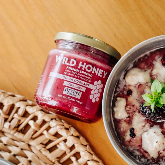
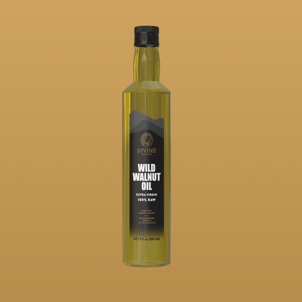
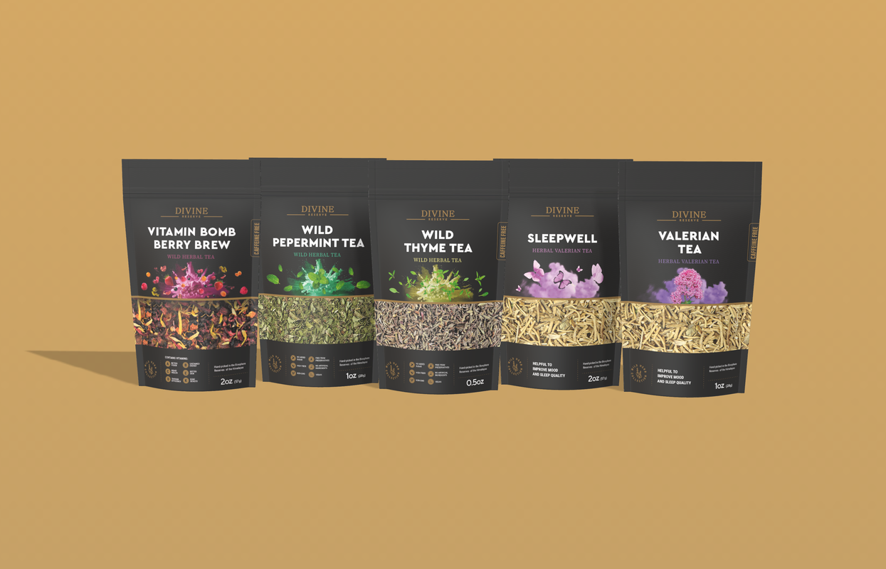
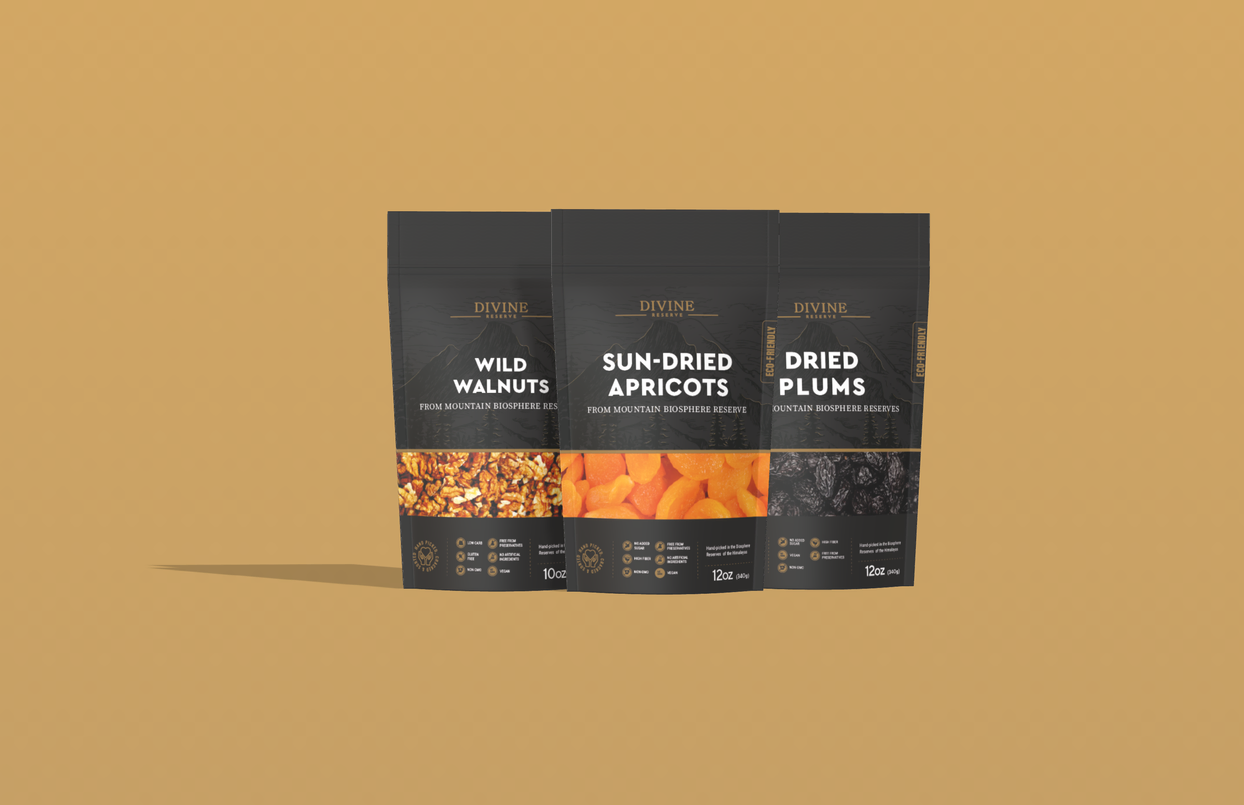
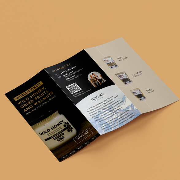
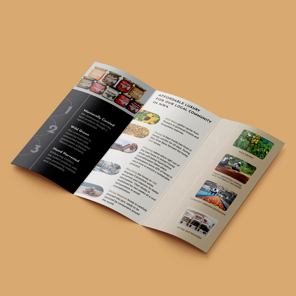
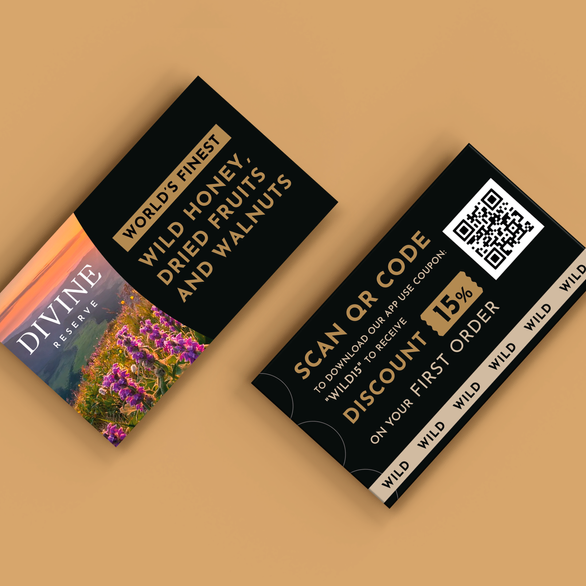
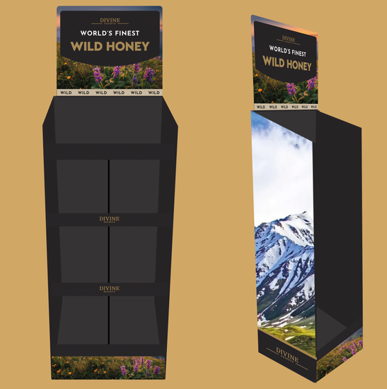
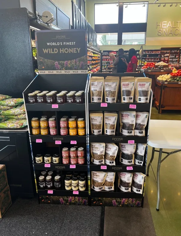
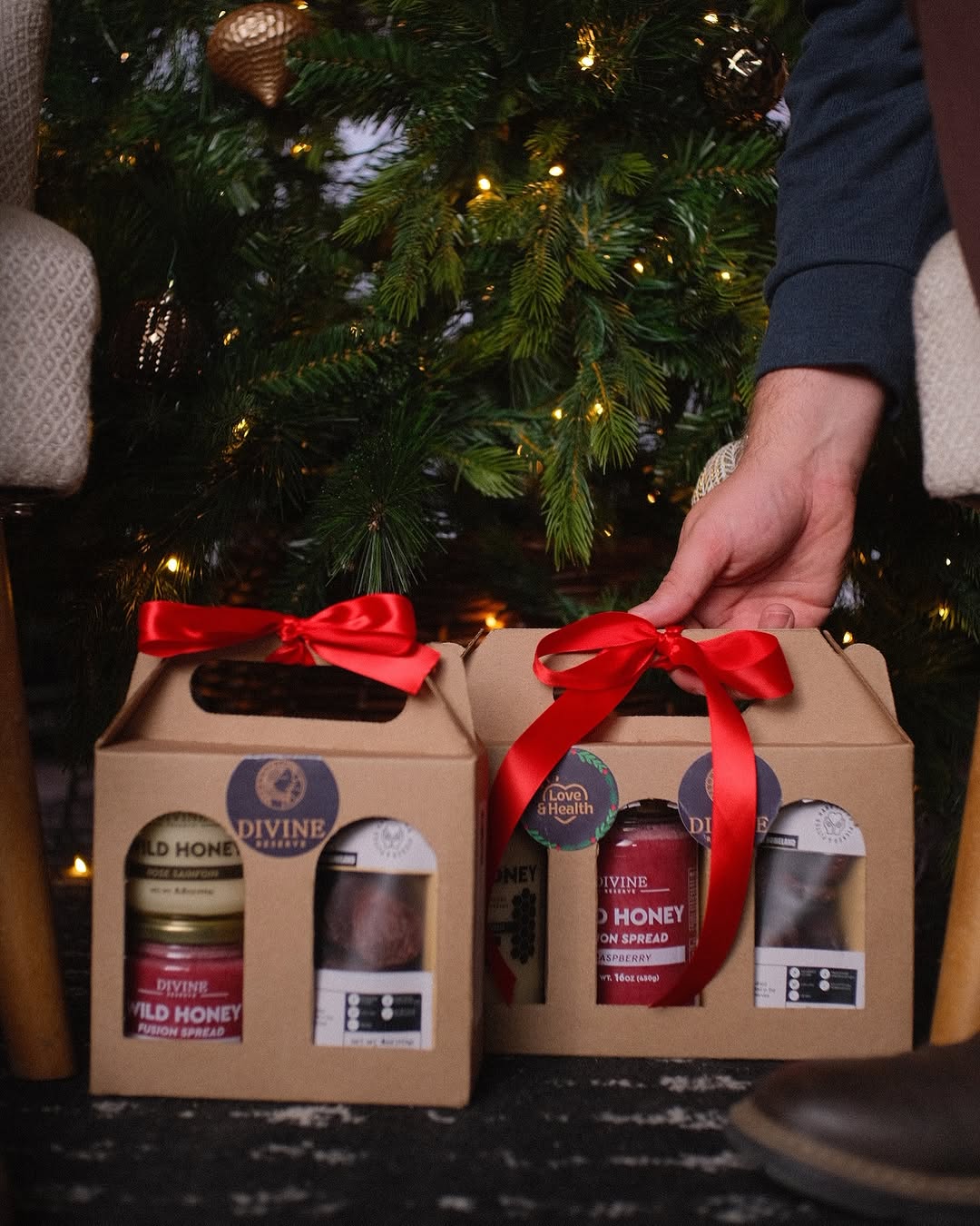
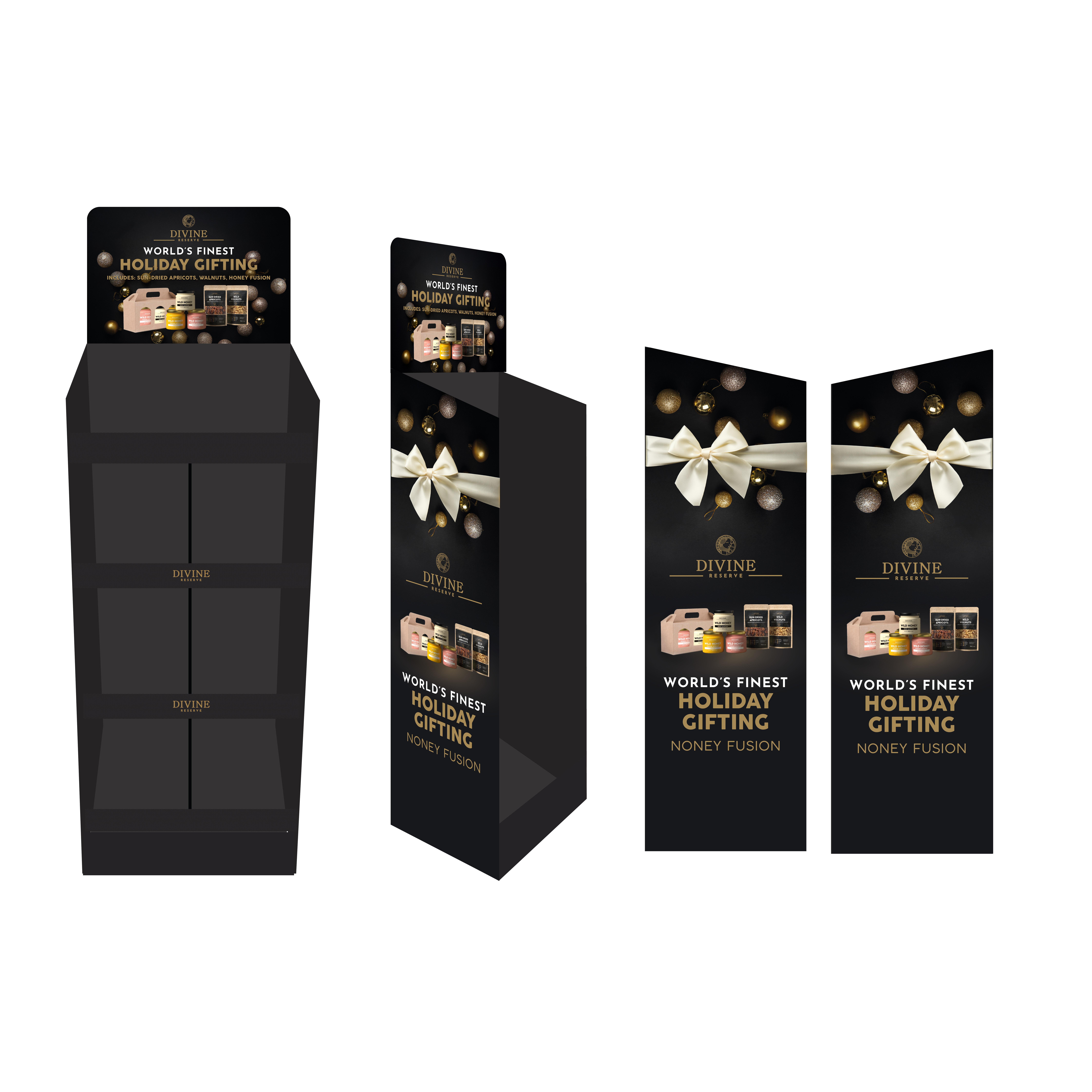
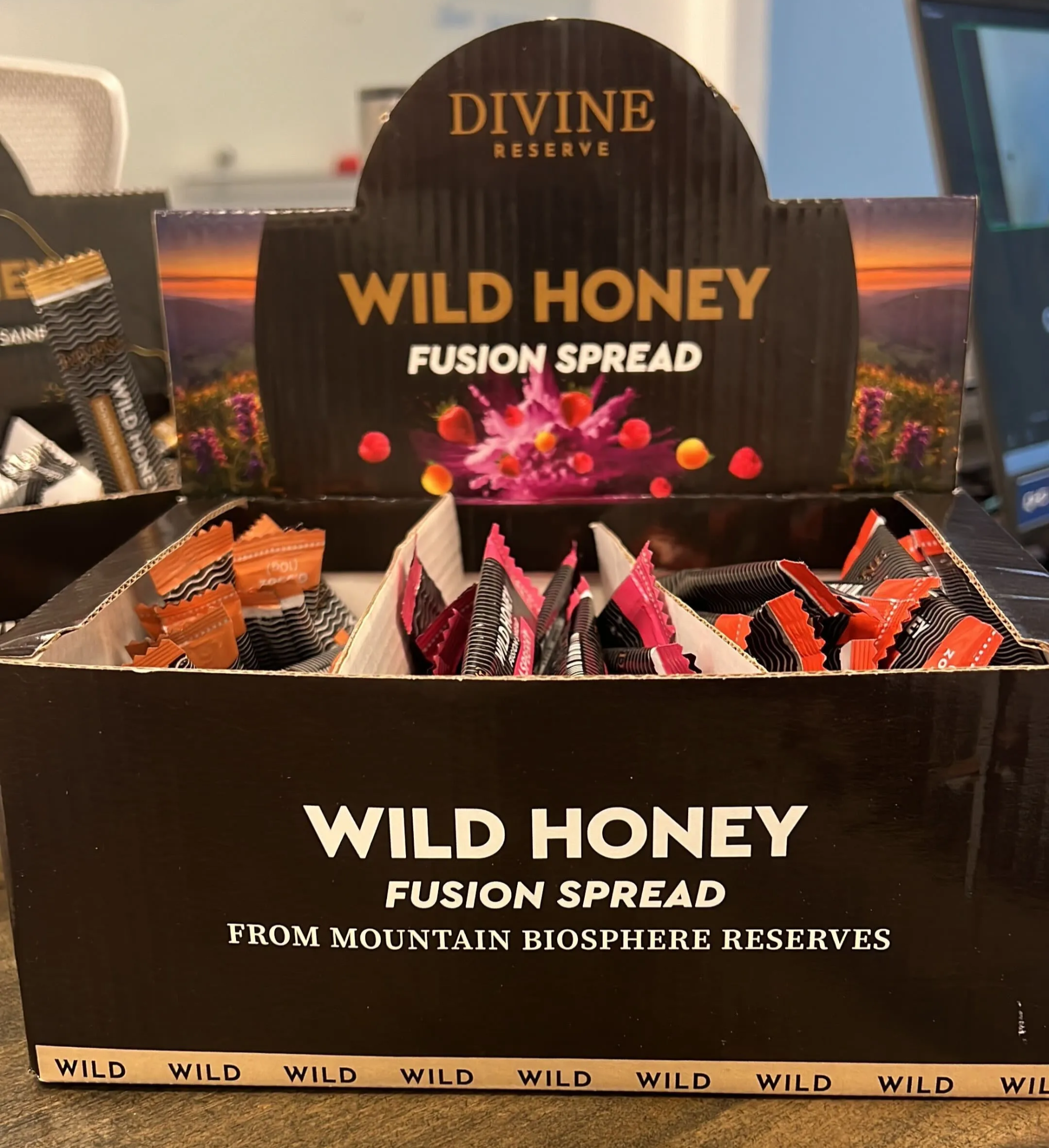
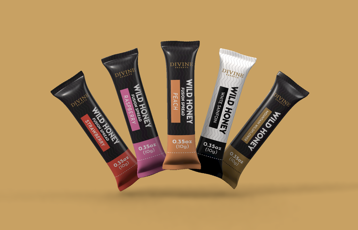
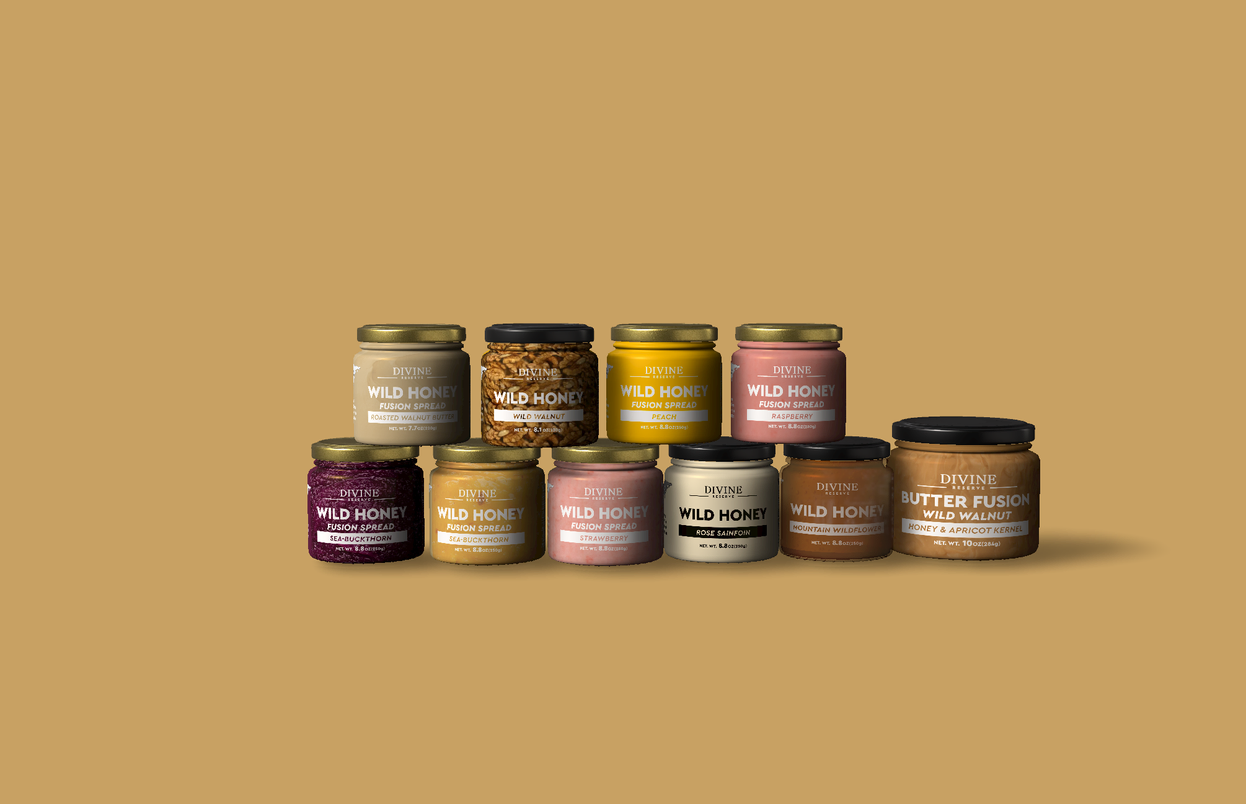
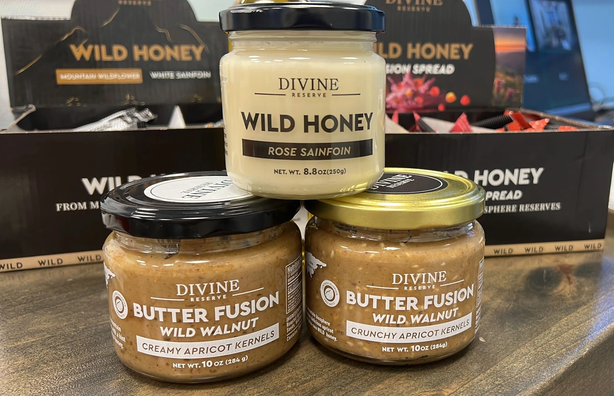
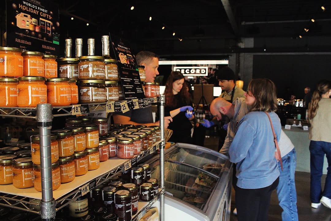
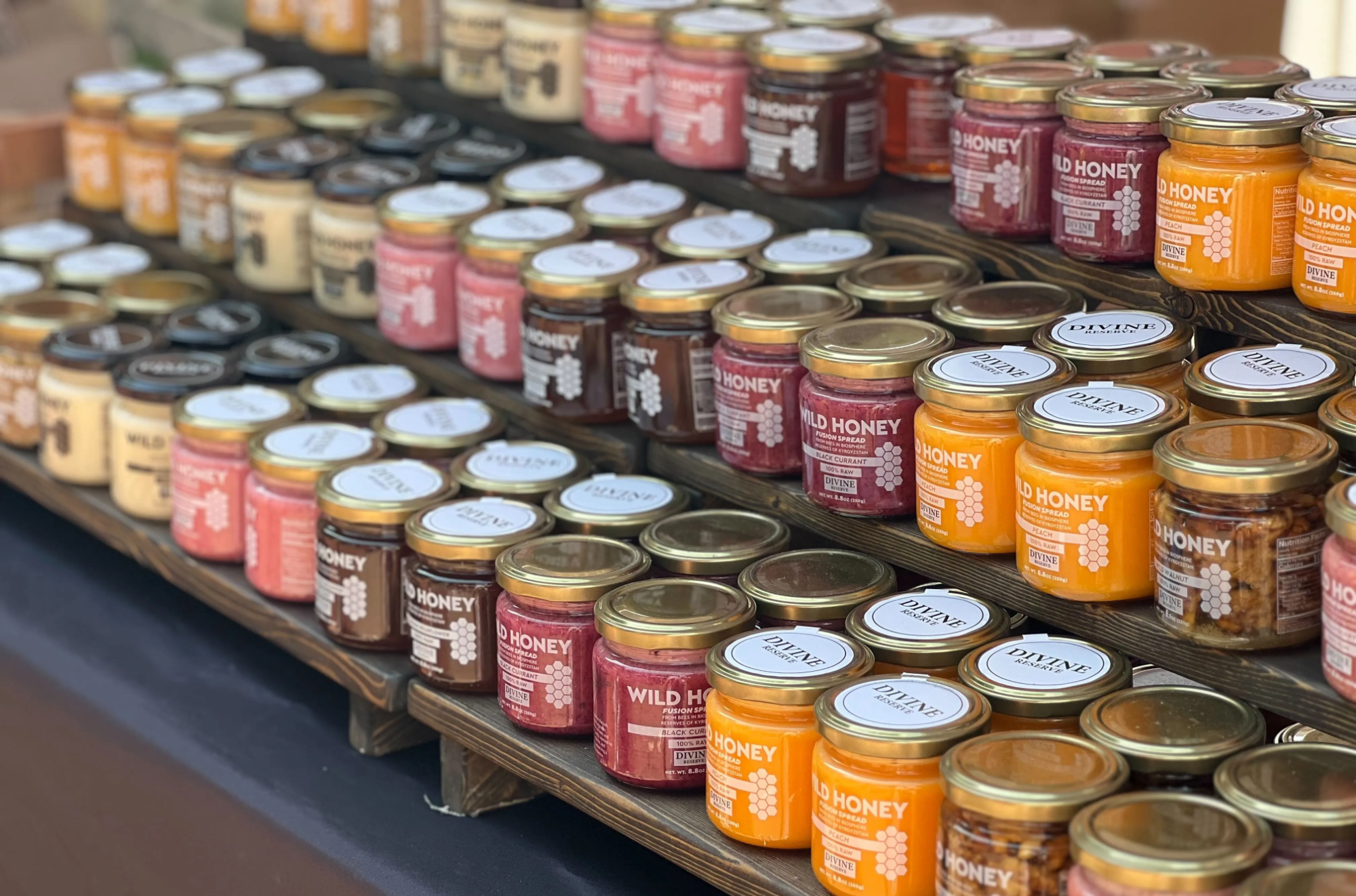
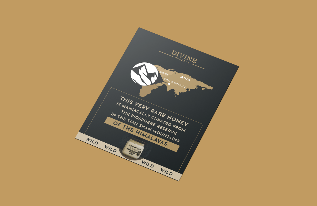
Divine Reserve is a supplier of the world's finest wild honey, dried fruits, and walnuts, sourced directly from Kazakhstan, a region of the Himalayan mountains. During the collaboration, I created a logo, brand identity, marketing materials, tea packaging, dried fruit packaging, a honey label redesign, label design for walnut oil, stick and tube designs, as well as various other POS materials.

The primary product of the brand is honey, sourced from the pristine mountainous regions of Kazakhstan, known for its unique and exceptional taste. The logo was designed to reflect the product’s premium quality, uniqueness, and exclusivity.
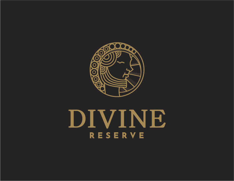
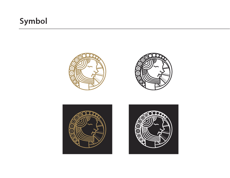
At the heart of the design is Aristaeus, the Greek god of honey, symbolizing tradition and craftsmanship. This reinforces the connection between the brand name Divine Reserve and its core product. The emblem takes the form of an ancient coin featuring Aristaeus, emphasizing the brand’s prestige and high status. The logo is crafted using fine lines, reminiscent of ancient carvings, adding a sense of heritage and authenticity.
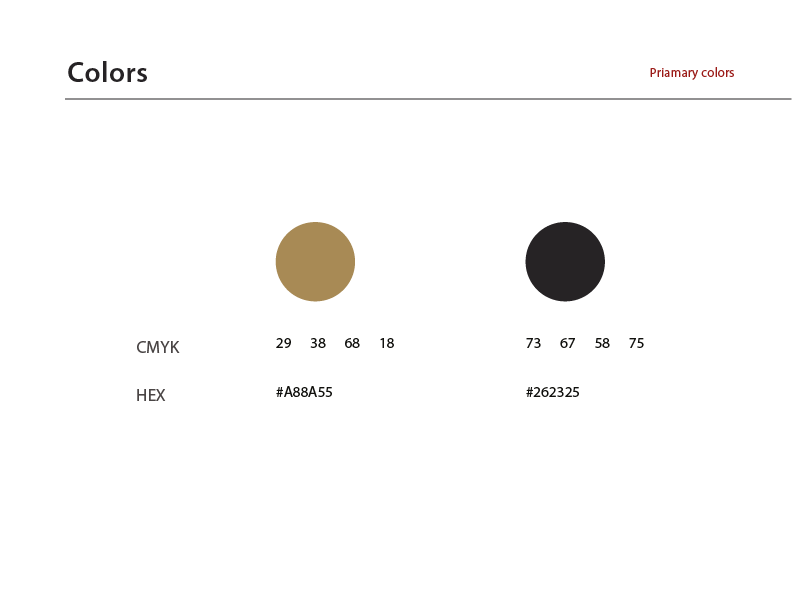
The chosen black and bronze colors enhance the brand’s luxury, sophistication, and premium positioning. Black represents elegance and exclusivity, while bronze reflects tradition and refinement.
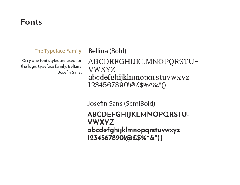
A serif typeface was selected for the text part of the logo, reinforcing heritage, reliability, and high-end quality. The refined serifs add a timeless and prestigious feel, aligning with the brand’s commitment to excellence.
The logo was designed to ensure excellent readability across both print and digital materials. It remains clear and recognizable on any medium—whether it's a small item like a pen or a large outdoor banner. This versatility makes the logo effective for all branding applications.
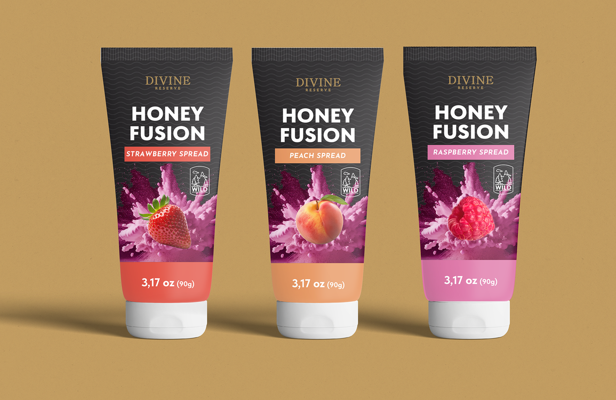
The DOY pack design highlights the premium quality of Kazakhstani tea with a luxurious black and gold color palette. For the central composition, I used a fruit explosion effect, visually representing the burst of flavors experienced with the first sip. Bright colors were chosen to emphasize excitement and add a modern, dynamic feel. To enhance sophistication, a contemporary typeface was incorporated, complementing the overall aesthetic. Additionally, iconography was used to improve readability and clarity. The DOY pack features a transparent window, allowing customers to see the product inside, reinforcing trust in its quality.

