One team
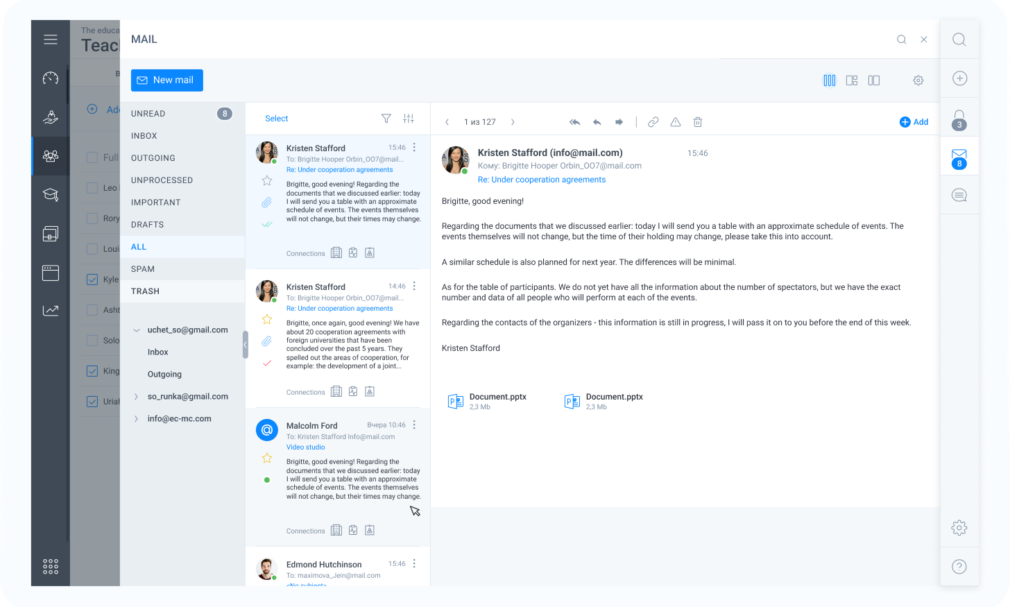
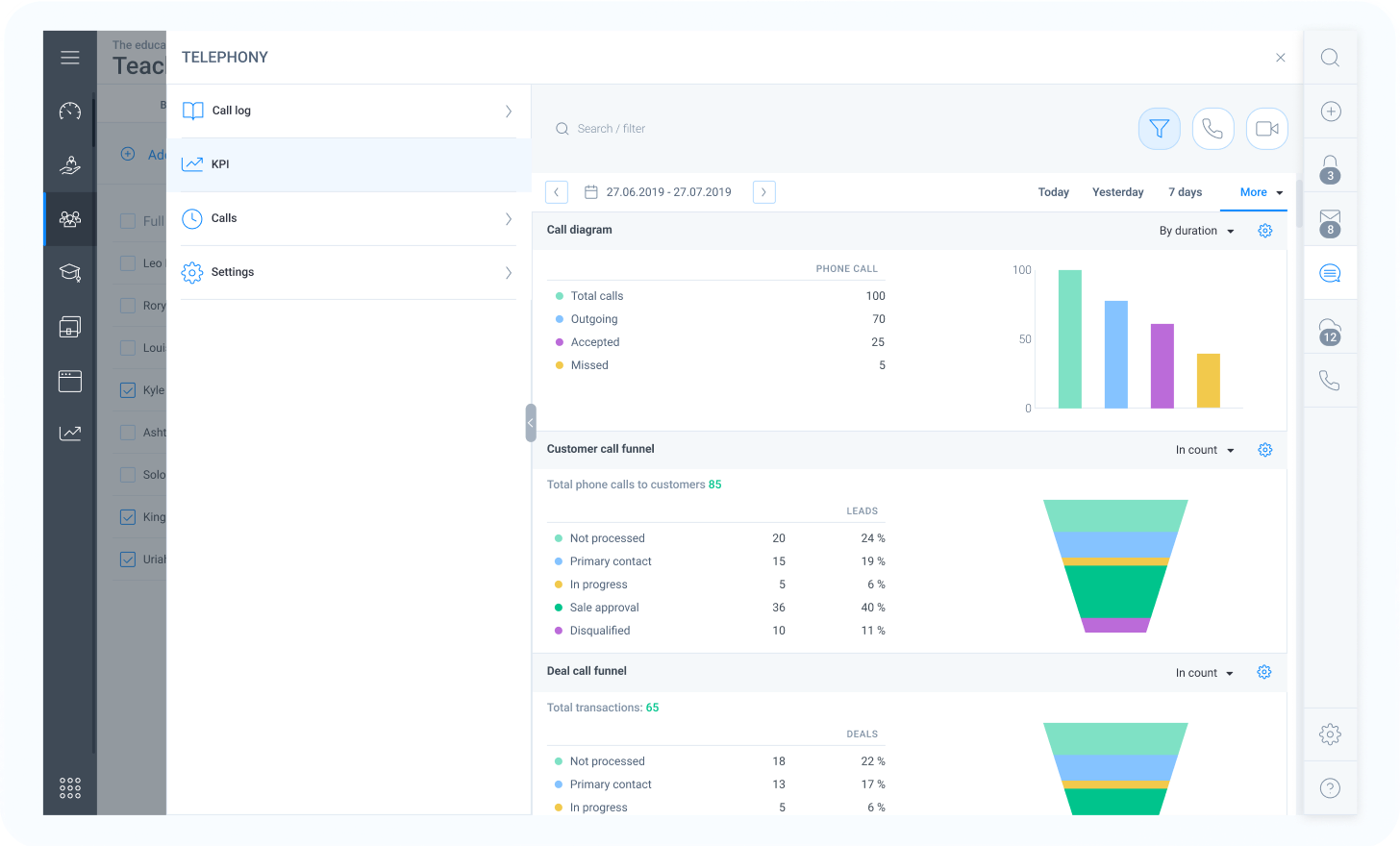
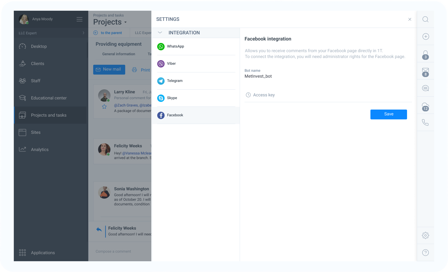
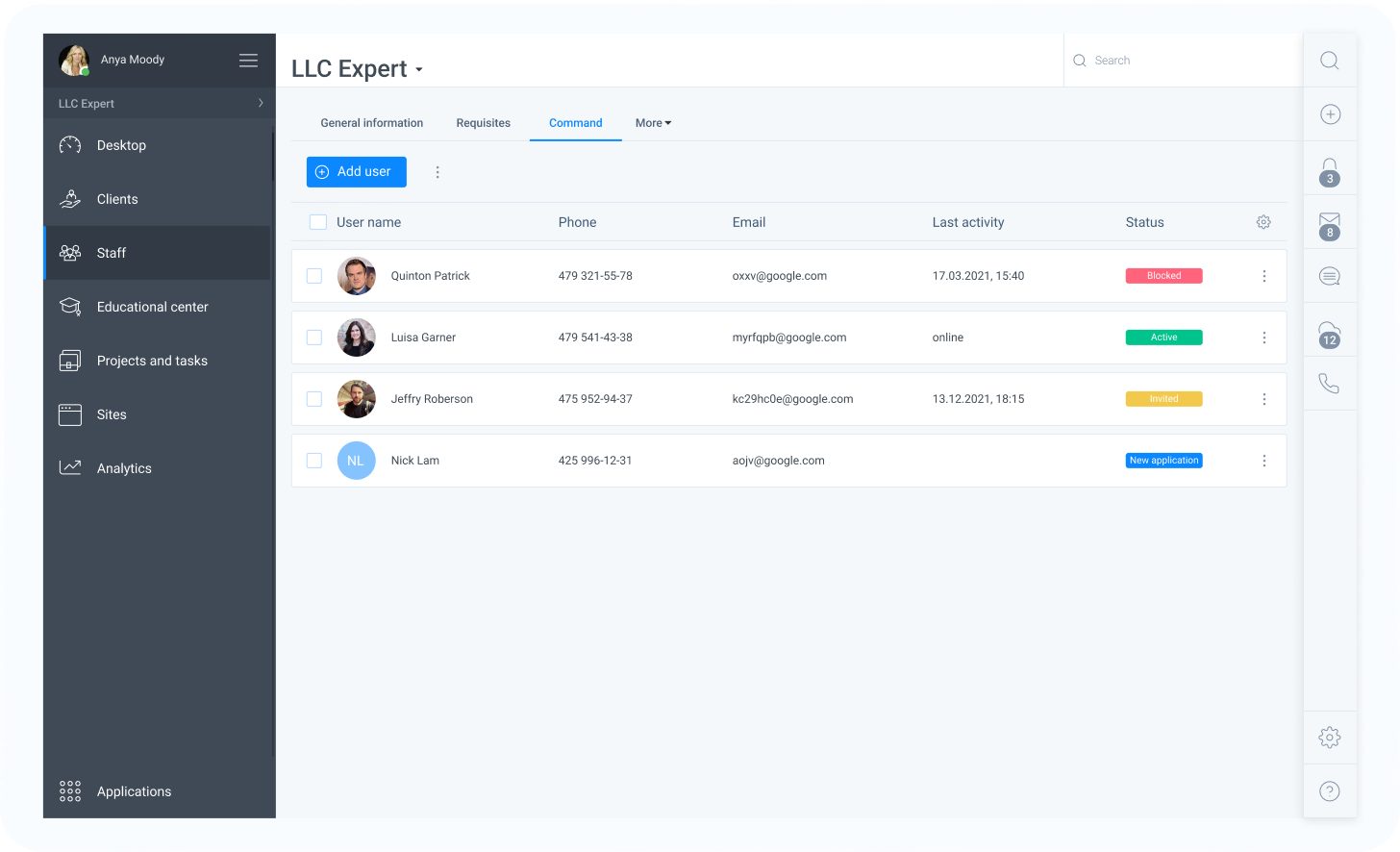
CRM system
A desktop application
CRM system
A desktop application
Project duration:
2021
Operating system:
Windows 10 and above, macOS 10.15 and above.
My role:
UI/UX Designer, Design System Specialist.
Responsibilities:
Wireframing, prototyping, visual design, design system creation, user testing, collaboration, documentation, accessibility compliance.
Tools:
Figma, Illustrator.
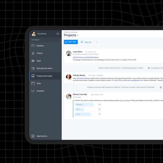
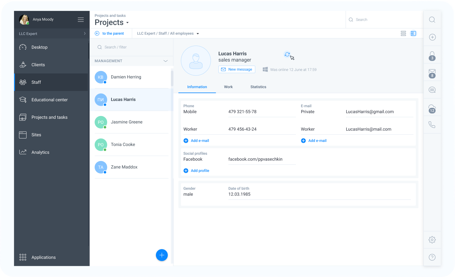
One team- a desktop application for a CRM, customizable for any field of activity, which is easily adaptable for any company.
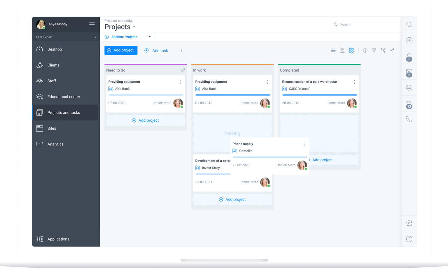
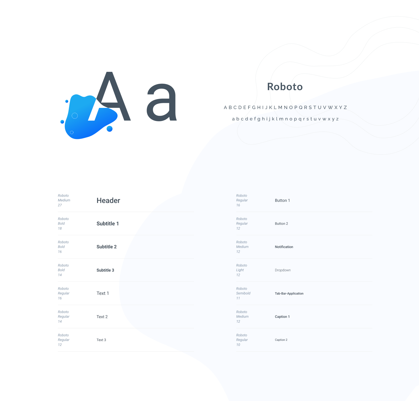
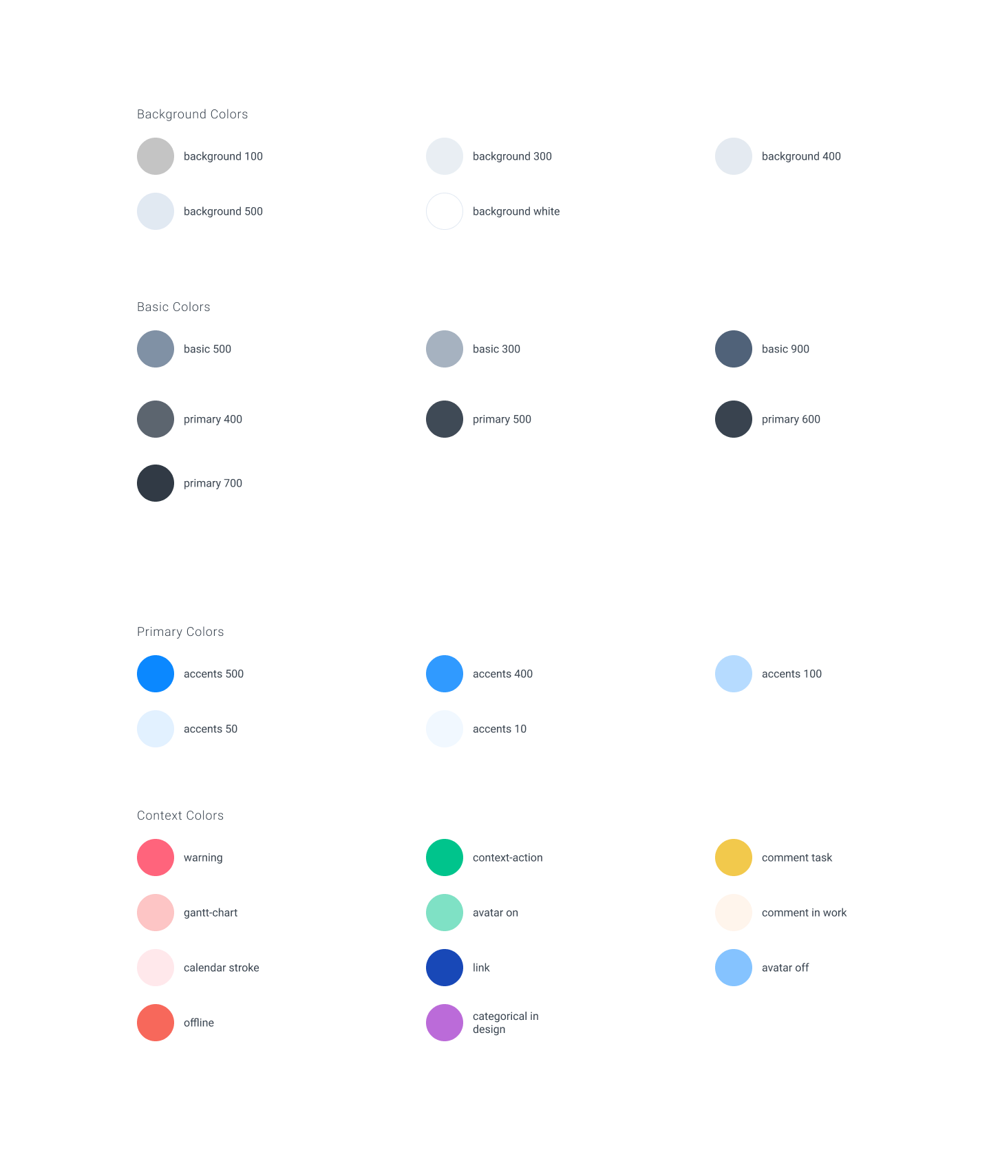
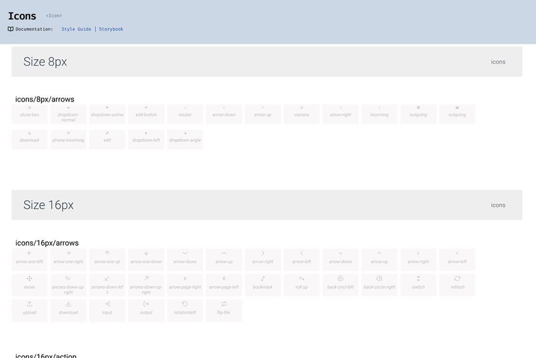
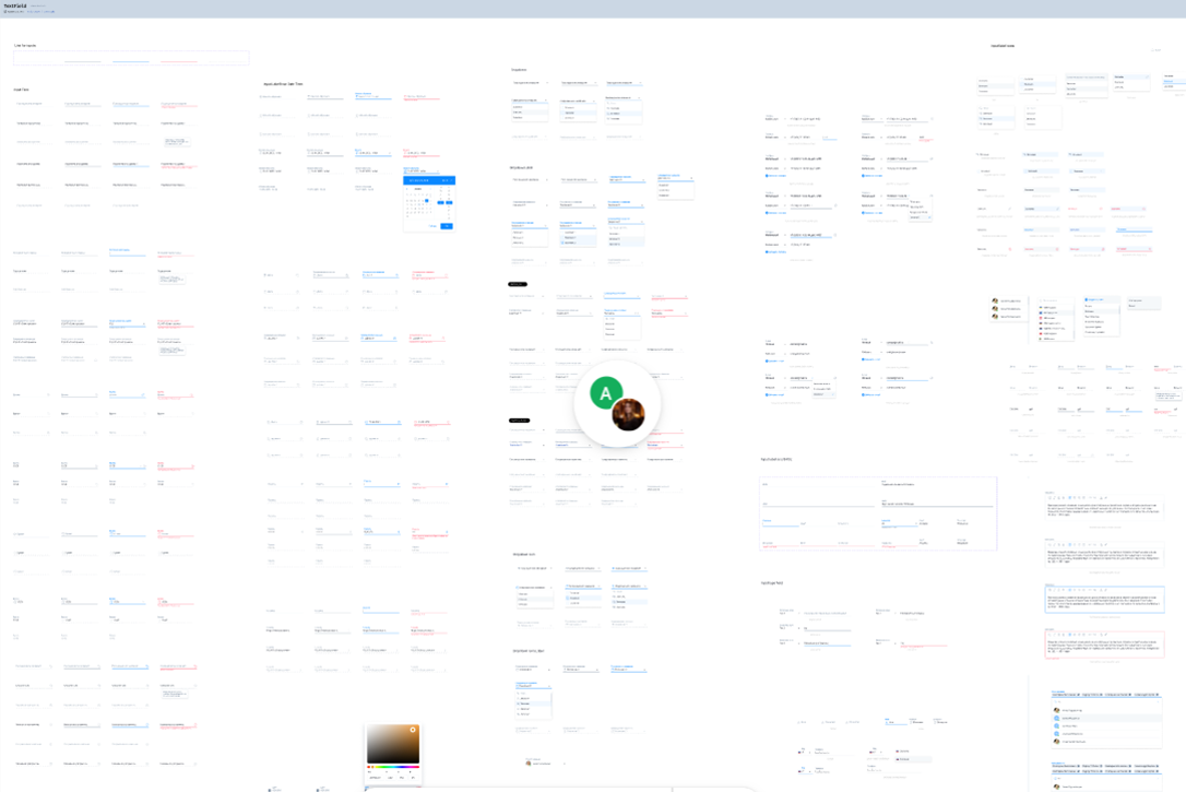
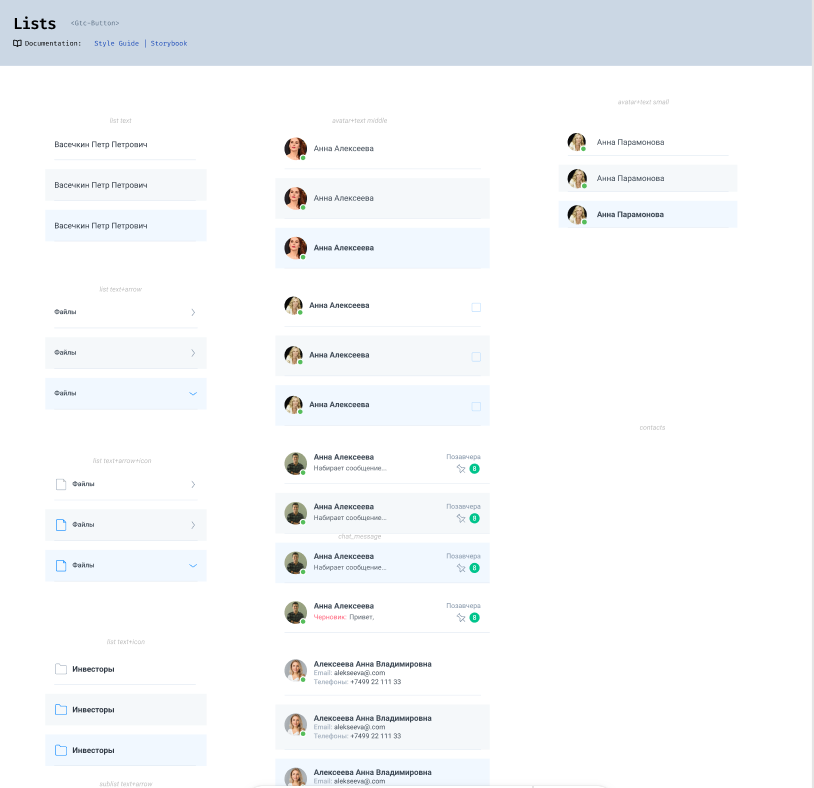
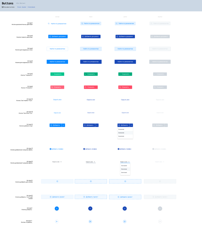
The Design system includes a variety of elements, such as typography, color palettes, iconography, grids, UI components, and design patterns. Also I was responsible for detailed documentations and guidelines that outline how these elements should be used, ensuring consistency and reducing the likelihood of design inconsistencies or errors. The main goal of the design system is to improve collaboration and productivity between designers and developers by providing them with a common language and set of tools. Having a set of predefined elements allows the team to work more efficiently, reduce redundant work, and create higher-quality projects that are easier to maintain and scale over time.
I used best practices of the following design systems in my work:
Together with our team, we decided that we would use the Material Design System as the basis for our system. This decision was made jointly with our engineering team.
Component librarie consists of reusable UI elements like buttons, forms, cards, and navigation menus that help create cohesive and consistent designs. These libraries act as a central hub for all the components within a design system.
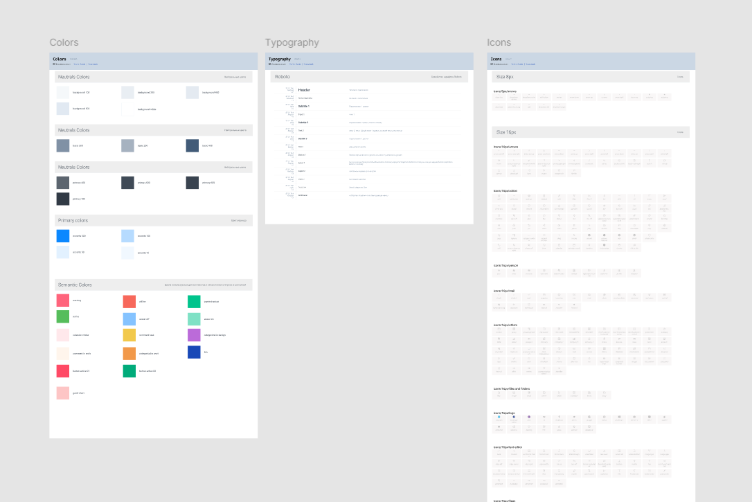
Roboto font family